A Lightness of Being.
A collaboration with TOAST for their seasonal concept.
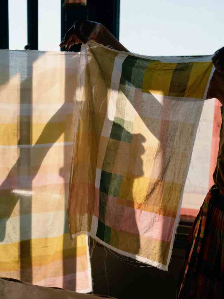
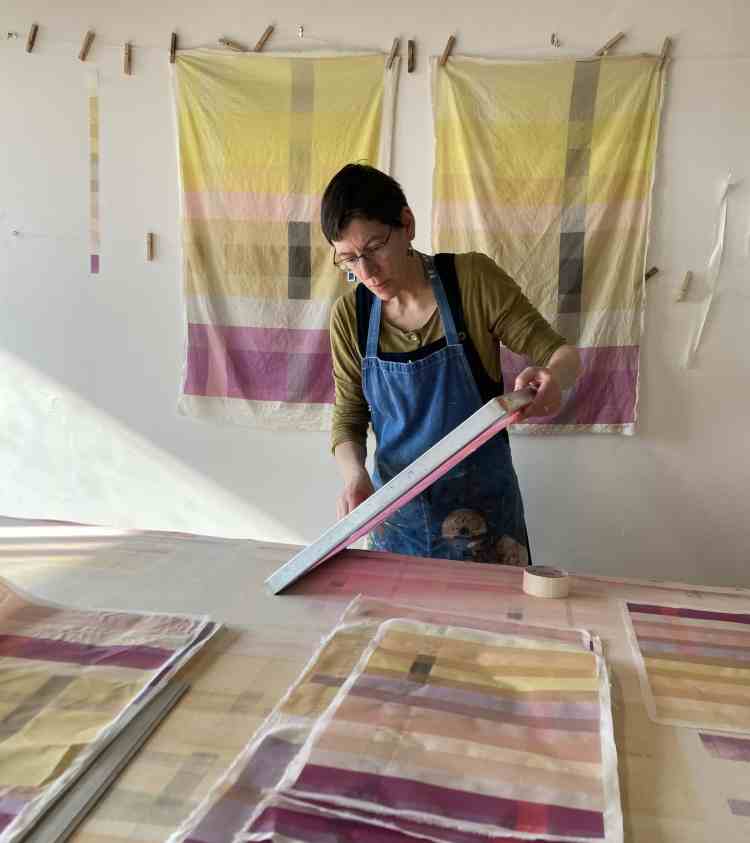
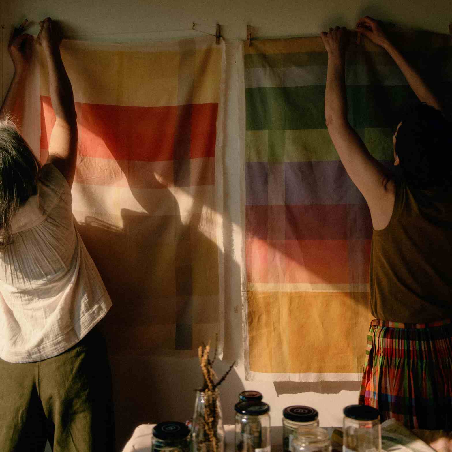
Ceres designed, printed, and curated panels in natural dyes to hang in the windows of all TOAST stores.

Mesmerised by two-hundred-and-thirty-one panels of criss-crossing soft-shades.
Each stripe of colour tells a story. Provenance is a tour of Western Europe; Burgundy oak, Brittany bark, London indigo.

Nettles. Fresh, just unfurling, from a rooftop garden, gently soaked for several days. Mixed with farmers marke red onions skins for deeper green. Or, Brixton weld from Flo’s garden for a vibrant shot of Spring.

Color of remembrance; madder roots from Susan Dye, of Rainbow’s colours. Orange transposing to pink, beautiful colours for the soul. Spanish pomegranates, holding images of sunshine and friends. Whiff of fermentation as we print.

We are immersed in our designs, slowly emerging from overlapping colours. Some sliding into peripheral consciousness, others boldy announce themselves.

Each panel unique. There is a longing to display them all together, festoon, to meander through tranquil swathes of lime, tangerine, cherry and cucumber.
Words: by Ceres.
Images: header, 1, 2, 3, and 5, by Lauren Maccabee for TOAST.
Image: 4, Ceres.
Discover more from Ceres Studio 1
Subscribe to get the latest posts sent to your email.
