
Visit Ceres, and the other Fabric Floor studio’s on the 5th and 6th December. We will have fabric for communal printing, alongside pieces from our recent collaborations, and design projects, for sale or to view.
Tag: Florence Hawkins
WSA Sustainable Luxury Textiles
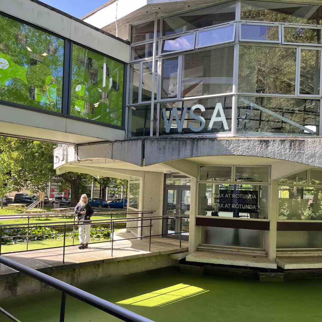

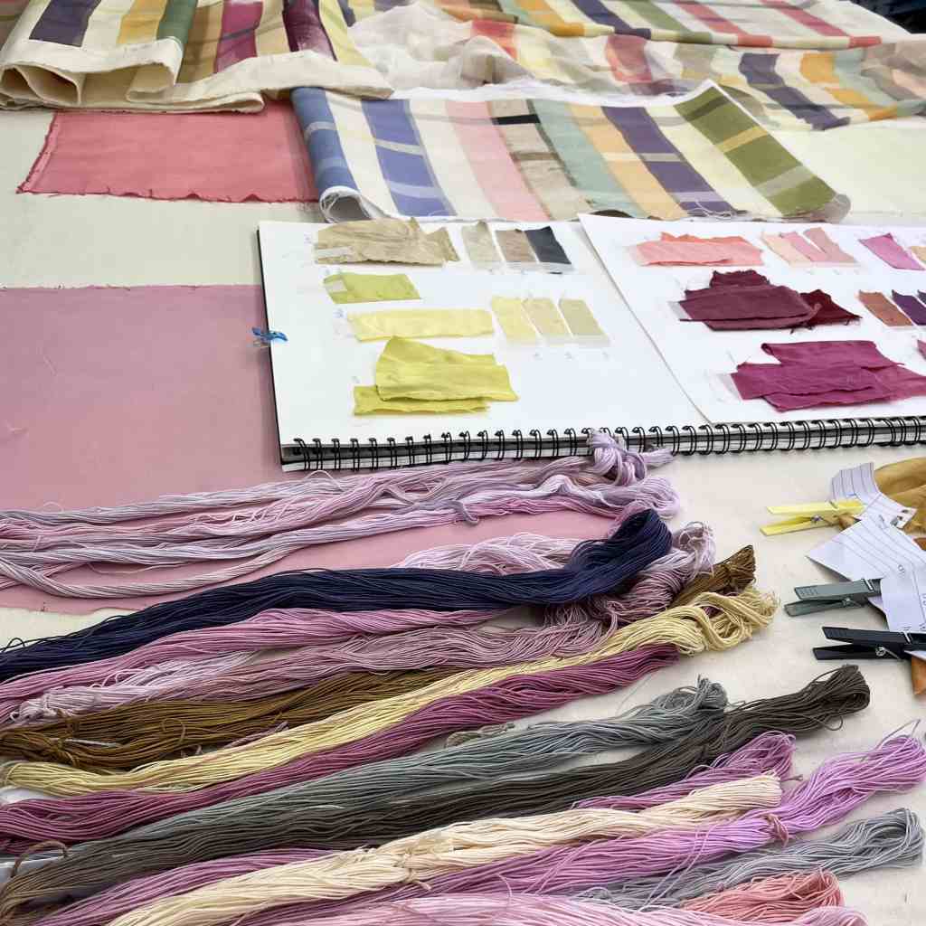
We were invited to Winchester School of Art to deliver bespoke training, advising on the set up of their sustainable natural dye-print labs. The BA Textiles department are taking the hugely exciting leap of transitioning from chemical to natural dyestuffs. We taught the staff how to forage for dye-plants (handily next to a park, and water meadows), and then how to make natural dyes into coloured vats and print-pastes. We developed techniques for them to use when teaching their new cohort of students; testing new plant colours, designing with natural dyes, and exploring warp and weave dyeing process.
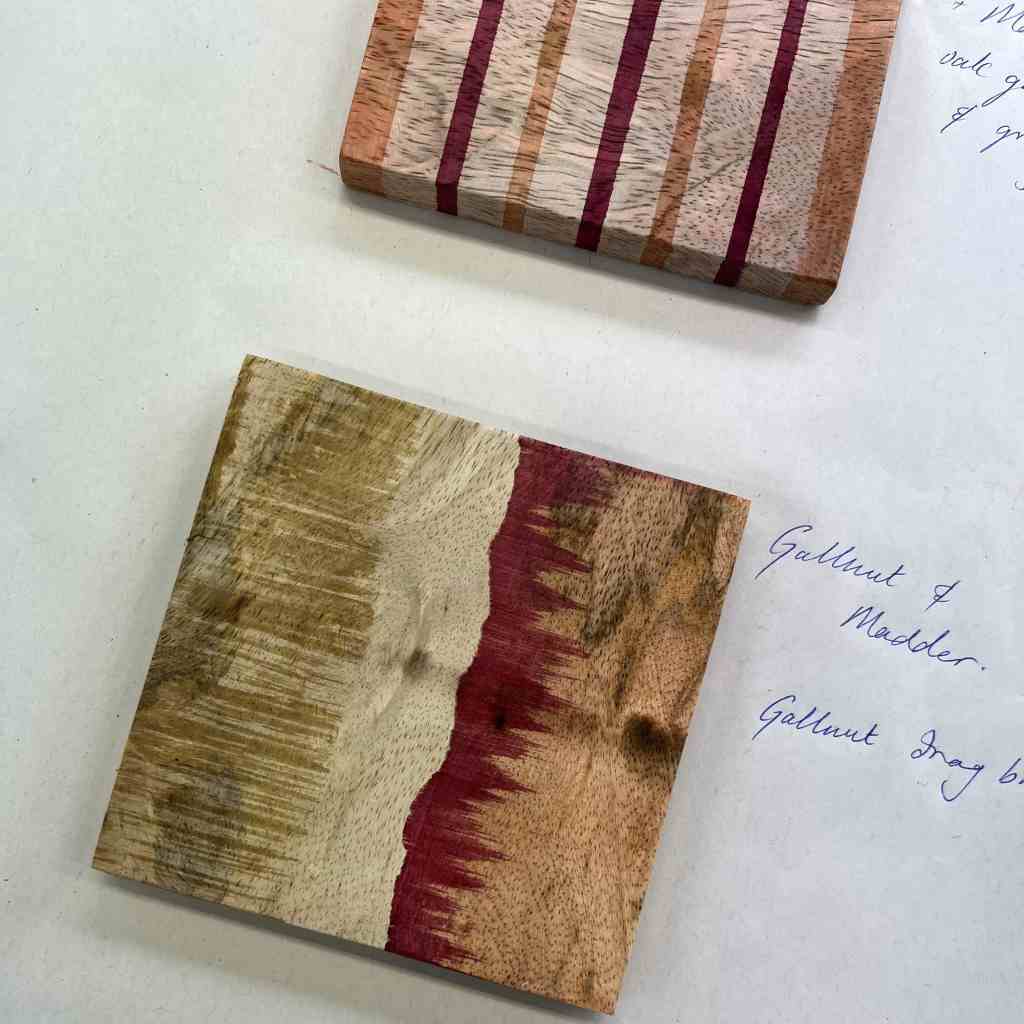
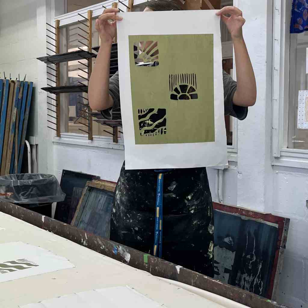
An inventive and immersive 3-days; collecting plants for experimential colour making, printing onto naturally dyed warps with modifiers, and playfully dyeing and painting onto wood.


On tour: TOAST London

On tour! Swooping through London, revelling in the clarity of a glorious sunshine-day. We wended bikes through the streets, to view our work adorning the TOAST store windows.
Bikes jostled by traffic in thronging Hampstead streets. Gathering speed on the train, then off, and cycling past a glam Islington wedding.
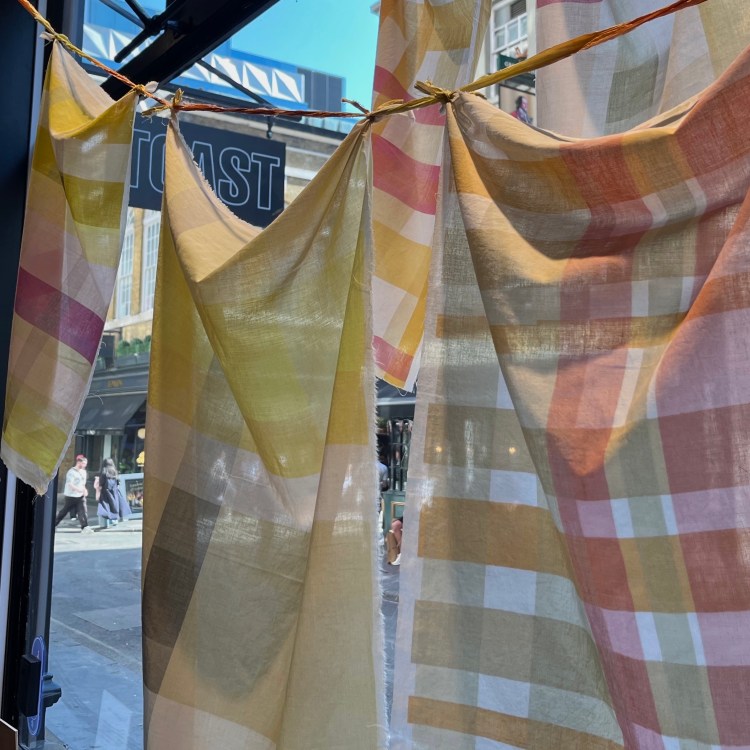
Dropping into the narrow streets of Shoreditch; the Toast store has a cool green garden.
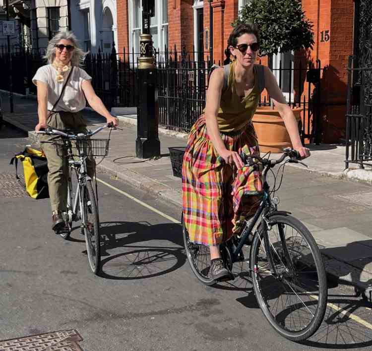
The afternoon meandered a tranquil route towards Soho, in a happy sustainable journey across London.
Love Toast Mayfair, the huge modern windows displaying fifteen panels. All the colourways, jaunty juxtapositions, prints vying for attention.
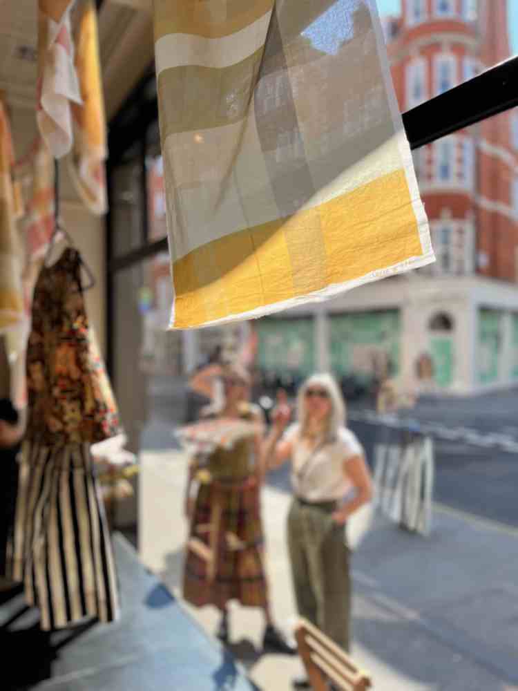
To have our work adorning shop windows in London’s iconic shopping districts; Kings Rd, Soho, Mayfair.
The printed panels can be seen in 23 Toast stores across England, London, and New York, throughout the month of May. The bike’s will not pedalo across the Atlantic.
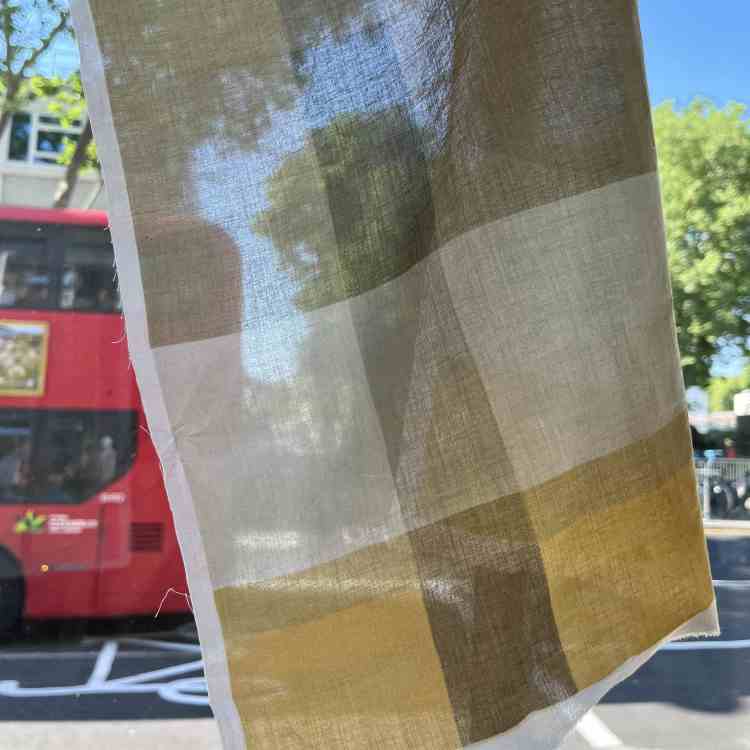
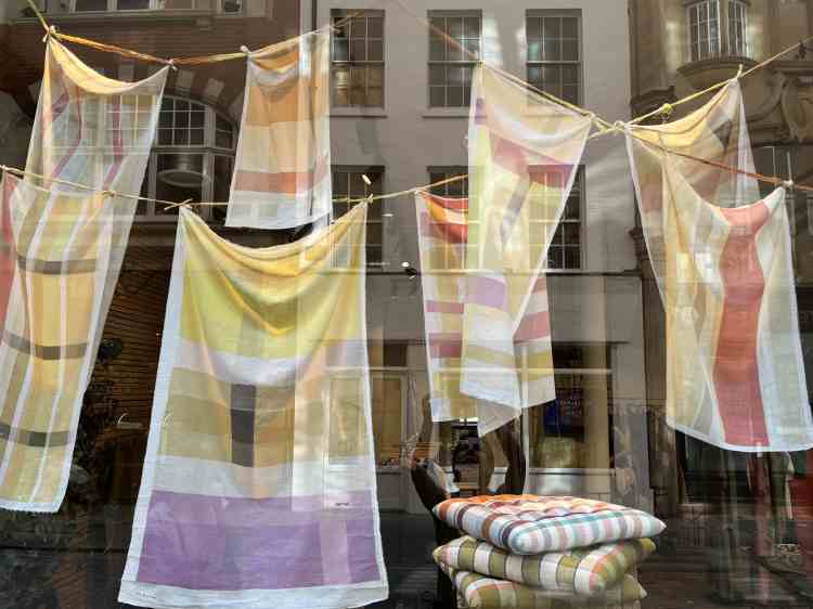
TOAST: Ceres
A Lightness of Being.
A collaboration with TOAST for their seasonal concept.
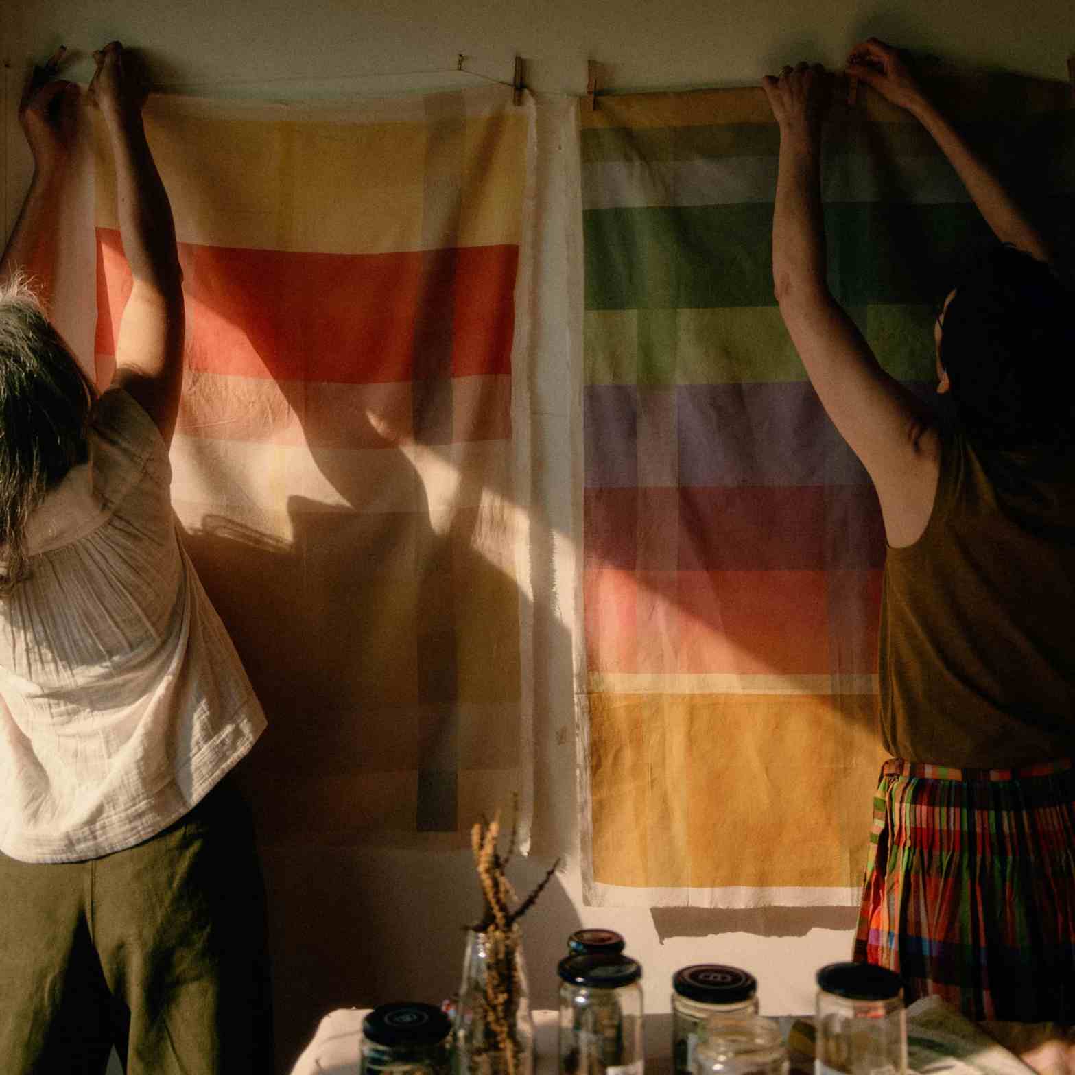
Ceres designed, printed, and curated panels in natural dyes to hang in the windows of all TOAST stores.

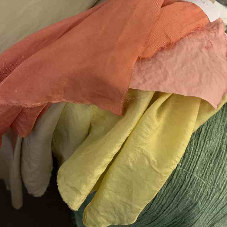
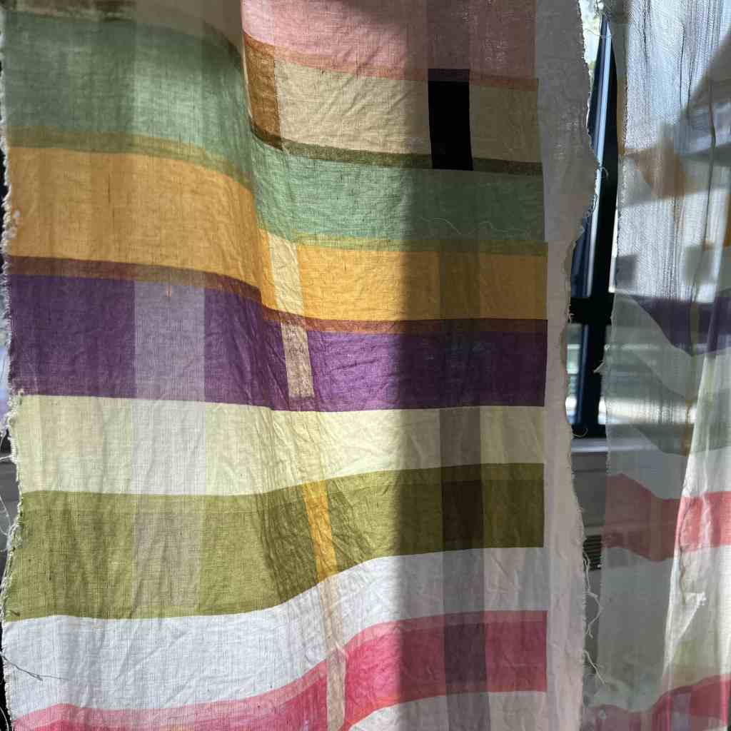
Mesmerised by two-hundred-and-thirty-one panels of criss-crossing soft-shades.
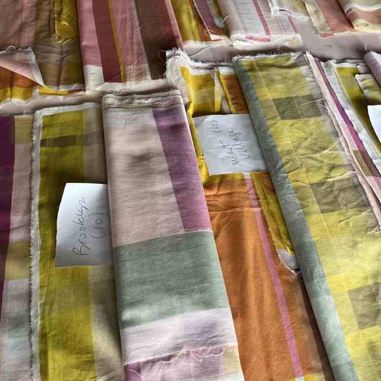
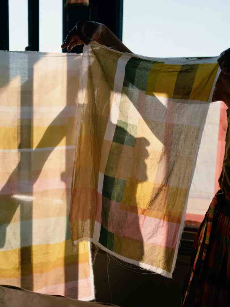
Each stripe of colour tells a story. Provenance is a tour of Western Europe; Burgundy oak, Brittany bark, London indigo.

Nettles. Fresh, just unfurling, from a rooftop garden, gently soaked for several days. Mixed with farmers marke red onions skins for deeper green. Or, Brixton weld from Flo’s garden for a vibrant shot of Spring.

Color of remembrance; madder roots from Susan Dye, of Rainbow’s colours. Orange transposing to pink, beautiful colours for the soul. Spanish pomegranates, holding images of sunshine and friends. Whiff of fermentation as we print.
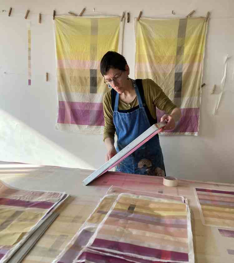
We are immersed in our designs, slowly emerging from overlapping colours. Some sliding into peripheral consciousness, others boldy announce themselves.

Each panel unique. There is a longing to display them all together, festoon, to meander through tranquil swathes of lime, tangerine, cherry and cucumber.
Words: by Ceres.
Images: header, 1, 2, 3, and 5, by Lauren Maccabee for TOAST.
Image: 4, Ceres.
